What is Data Interpretation?
Data Interpretation: Data interpretation is the process of
assigning meaning to the collected information and determining the conclusions,
significance, and implications of the findings.
Data interpretation is the process of reviewing data through
some predefined processes which will help assign some meaning to the data and
arrive at a relevant conclusion. It involves taking the result of data analysis, making
inferences on the relations studied, and using them to conclude.
Therefore,
before one can talk about interpreting data, they need to be analyzed first.
What is
data analysis?
Data analysis is the process of ordering, categorizing,
manipulating, and summarizing data to obtain answers to research questions. It is usually the first step taken towards
data interpretation.
It is
evident that the interpretation of data is very important, and as such needs to
be done properly. Therefore, researchers have identified some data
interpretation methods to aid this process.
What is a
data interpretation skill & example?
The data
interpretation refers to the ability of a person to correctly extract,
analyze meaningful information or data from the various data
sources/examples such as charts, tables, graphs, etc. It involves different steps like data
requirement, data collection, data processing & data analysis.
The goal
of the interpretation of data is to highlight useful information and
suggest conclusions.
Data interpretation and analysis are fast becoming
more valuable with the prominence (famous) of digital communication, which
is responsible for a large amount of data being churned out daily.
Based on
this report, it is clear that for any
business to be successful in today’s digital world, the founders need to know
or employ people who know how to analyze complex data, produce actionable
insights and adapt to new market trends. Also, all these need to be done in
milliseconds.
What are
the steps in interpreting data?
After
data collection, you’d want to know the result of your findings. Ultimately,
the findings of your data will be largely dependent on the questions you’ve
asked in your survey or your initial study questions.
There are
four steps to data interpretation:
1)
Assemble the information you'll need,
2)
Develop findings,
3)
Develop conclusions, and
4)
Develop recommendations.
1. Assemble/Gather
the data
The very first step in interpreting data is having all the
relevant data assembled. You can do this by visualizing it first either in a
bar, graph, or pie chart. The
purpose of this step is to accurately analyze the data without any bias.
Now is
the time to remember the details of how you conducted the research. Were there
any flaws or changes that occurred when gathering this data? Did you keep any
observatory notes and indicators?
Once you
have your complete data, you can move to the next stage
2. Develop
your findings
This is
the summary of your observations. Here, you observe this data thoroughly to
find trends, patterns, or behavior. If you
are researching about a group of people through a sample population, this is
where you analyze behavioral patterns. The purpose of this step is
to compare these deductions before drawing any conclusions. You can compare
these deductions with each other, similar data sets in the past, or general
deductions in your industry.
3. Derive
Conclusions
Once you’ve developed your findings from your data sets, you
can then draw conclusions based on trends you’ve discovered. Your conclusions should answer the
questions that led you to your research. If they do not answer these questions
ask why? It may lead to further research or subsequent questions.
4. Give
recommendations
For every
research conclusion, there has to be a recommendation. This is the final step
in data interpretation because recommendations are a summary of your findings
and conclusions. For recommendations, it can only go in one of two ways. You can either recommend a line of action or recommend
that further research be conducted.
What are
Data Interpretation Methods?
Data interpretation methods are how analysts help people
make sense of numerical data that has been collected, analyzed
and presented. Data,
when collected in raw form, may be difficult for the layman to understand,
which is why analysts need to break down the information gathered so that
others can make sense of it.
For example, when founders are pitching to potential
investors, they must interpret data
(E.g. market size, growth rate, etc.) for better
understanding.
There are 2 main methods in which this can be done,
namely;
1.Quantitative methods
2.Qualitative methods
Qualitative Data
Interpretation Method
Ø The
qualitative data interpretation method is used to analyze qualitative data,
which is also known as categorical data. This method uses texts,
rather than numbers or patterns to describe data.
Ø Qualitative data is usually gathered using a wide variety
of person-to-person techniques, which may be difficult to analyze
compared to the quantitative research method.
Ø Quantitative data can be analyzed
directly after it has been collected and sorted
Ø Qualitative
data needs to first be coded into numbers before it can be analyzed. This
is because texts are usually cumbersome, and will take more time and result in
a lot of errors if analyzed in its original state. Coding done by the analyst
should also be documented so that it can be reused by others and also
analyzed.
Quantitative
Data Interpretation Method
The
quantitative data interpretation method is used to analyze quantitative data,
which is also known as numerical data. This data type contains
numbers and is therefore analyzed with the use of numbers and not texts.
Visualization
Techniques in Data Analysis
One of
the best practices of data interpretation is the visualization of the dataset.
Visualization makes it easy for a layman to understand the data, and also
encourages people to view the data, as it provides a visually appealing summary
of the data.
There are different
techniques of data visualization, some of which are highlighted below.
Bar Graph
A bar graph is nothing but
a pictorial representation of data wherein every independent variable attains
only discrete value. They are used for representing various types of data.
The bar
graph is one of the frequent methods used to present various types of data. It
is usually asked in the data interpretation section of the competitive exams.
In data interpretation, it is the representation of data where the vertical
bars are placed at equal distance from each other. The value of the data
represented is given by the height and length of the bars. The width here is not important it is only
used so that the presentation is clear.
They are
plotted against the horizontal axis known as the x-axis. The value can be shown
by coloured or shaded vertical bars of equal width. In a horizontal bar graph,
the values are plotted against the vertical axis called the y-axis. They are
commonly used as the data can be easily analyzed.
Line Graphs:
· Line graphs are
diagrams that present data using dots and lines. One variable is indicated on
the vertical line, and the other is indicated on the horizontal.
Pie Charts:
· A pie chart
shows the relationships between parts to a whole. The whole is contained in the
circle (pie) and divided into appropriately sized proportions, or slices.
Interpretation of Graphs
Interpretation of a graph
involves reading, understanding and expressing the data represented in a verbal
(the form
of words) medium. In other words,
after consulting the graph, you must be able to transfer the data into a report
in the form of a paragraph of about 100 – 150 words.
Tips for writing a report/ Interpretation based on a graph
while writing a report,
take into account the following.
Title: The kind of information found on the graph
Key: Additional information included in the graph
Scale: Tells how many or how much
Axis lines:
Vertical axis runs along the side of the graph.
The horizontal axis runs across the bottom of the graph.
Bar labels:
Describe individual parts of the graph
Question 1.
Look at the following bar graph followed by a report.
Literacy rate in India
after Independence

A
report based on the graph can be like this:
The above bar graph
represents the literacy rate in India after independence. Spread over a
duration of 60 years (from 1951 to 2011), the rate of literacy has attained a
steady growth from just 16.7 percent in 1951 to a considerable 74.04 in 2011.
As can be ascertained from the graph, in the initial years of independence,
i.e, during the first 30 years , the growth rate has been below ten percent.
There is a big leap
in the 1980s as there is an all time increase of 14 percent. The next decade
has also witnessed a growth of about 13 percent. The rate has witnessed a fall
in the next decade as it is less than 10 percent. The policies of the Governments
and their implementation might be the reason for the unsteady trend in the
growth of literacy rate. However, the overall growth is promising since it is
about to cross 75 percent in 2011.
Question 2.
Here
is a bar chart showing the results of a survey on the working patterns of both
rural and urban women. The chart provides information about how these women
spend the hours of their day for some chosen activities on average. Based on
this information, write a report in about 150 words.
![]()
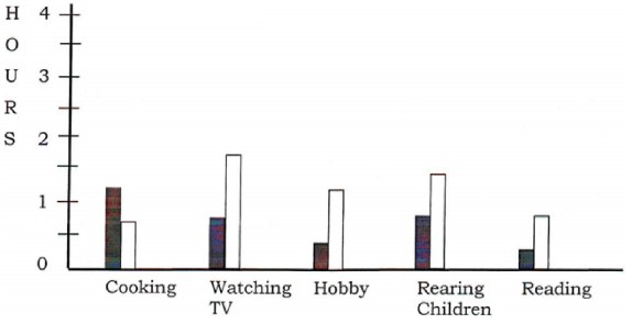
The
above bar chart gives the results of a survey on the working patterns of both
rural and urban women. The chart clearly tells us that rural women spend less
than an hour at cooking than their urban counterparts who spend nearly two
hours in cooking. Rural women spend only half an hour in watching TV. While
urban women watch TV for more than an hour. Rural women spend less than half an
hour for hobbies while urban women spend 45 minutes. Rural women also lag
behind urban women in the time spent at rearing children on which urban women
spend nearly two hours. Furthermore, due to women illiteracy in the rural area,
the time spent in reading is very less, where as urban women read for about
half an hour in a day. Totally this chart provides the information that the
rural women are spending less time in all their activities compared the urban
women.
Question 2.
The pie chart given below
represents the results of a survey conducted by a non – profit NGO to
understand how a rural family spends its income on various items. Based on the
information, write a report in about 200 words.

The
above pie chart gives the results of a survey conducted by a non – profit NGO
to understand how a rural family spends its income on various clothing. A Rural
family spends 30% of its income on food and which is very important and
necessary. Nearly 25% of their income is spent on Health, because of lack of
hygiene. They spend only 10% on education because a number people are engaged
in agricultural activities. They spend only 10% on savings. This is very less
savings They spend 20% of their income in repaying loans. They have to borrow
large amount of money for agricultural activities.
Question 3.
The
line graph given below shows population growth during pre-independence and post
independence period in India. Use the information to write a report on the
trends of population growth.

The above line graph shows the population growth during the pre-independence and post-independence period in India. Over a duration of 40 years during pre-independence, the population was just below one crore people but by the end of the decade during 1910 it started to rise steadily and crossed one crore. After independence, within ten years the – population increased to 1.7 crores. It grew to 2.8 crores by the end of 1960. After 1970 it rose to 3 crores and during the period from 1970 to 2000 it grew sharply to over five crores. In the decade between 2000 and 2010 the population of India crossed the six crores mark.
QUESTION 5

(SOLUTION)
No comments:
Post a Comment